
HEALTHESCAPE
Behaviour Design · Mobile App · Self-Initiated · 2024
Role: UI UX Designer
Type: App Design
Duration: 2-3 Weeks
Tools: Figma · Adobe Suite
THE HOOK
Most health apps measure
what you've already done.
Healthescape was designed around what you'll do tomorrow.
Open any health app on your phone right now. Within thirty seconds you'll be looking at calories burned, macros tracked, steps counted, sleep scored, stress levels measured, hydration logged.
You will feel overwhelmed before you've done a single healthy thing.
That's the problem Healthescape was built to solve. Not lack of information — there's too much of that already. The problem is friction. The gap between knowing what to do and actually doing it. Between opening an app and feeling motivated rather than judged.
Most health apps are dashboards. Healthescape is a habit machine. The homescreen doesn't show you data. It shows you four things you can do today. A circular progress ring tells you how far you've come. A streak counter tells you you showed up yesterday.
That's it. That's the whole product philosophy.

THE USER
Two people. One shared frustration.
Apps that feel like homework.
Before I designed a single screen I needed to understand why people abandon health apps. Not why they download them — everyone downloads them — but why they stop using them within two to three weeks.
The answer wasn't lack of motivation. It wasn't lack of time. It was cognitive overload. The apps were asking people to do too much mental work before they could do any physical work.

THE SHARED INSIGHT
Neither of them needed more data. They needed less friction between intention and action.
The design principle that shaped every decision that followed: make habit completion easier than skipping it.
THE SYSTEM
Structure first. Simplicity by design, not by accident.
Simplicity is hard to design. Every feature you remove is a stakeholder conversation. Every screen you keep blank is a decision you have to defend. The architecture of Healthescape was built around one question: what is the minimum structure needed for someone to build a daily health habit?
The answer was four sections — not twenty. Home for daily action. Progress for accountability. Community for motivation. Premium for depth when the user is ready for it. Everything else was cut.
THE IINFORMATION ARCHITECTURE
Four primary sections. Every screen designed to reduce cognitive load, not add to it.

Before any visual decisions, I worked through the information hierarchy in wireframes. Every screen had to answer one question: can this be done faster and simpler? The wireframes deliberately stripped out colour, illustration, and personality — to test whether the structure worked on its own. If a screen needed decoration to feel useful, the structure was wrong.
WIREFRAMES
Stripping out everything except structure — testing the logic before the aesthetics.

THE DESIGN DECISIONS
Two decisions that made this feel calm
instead of clinical.
Health apps have a visual language problem. Most of them look like fitness equipment — hard edges, aggressive typography, high contrast, performance metrics everywhere. They're designed to motivate through intensity. Healthescape was designed to motivate through gentleness. The visual decisions weren't aesthetic preferences — they were behaviour design choices.
Decision 01
The goal tile system — and the details that make it work.
The home screen shows four goal tiles: Walk 10,000, Drink 9 glasses, Meditate twice, Burn 420 Cal. Each tile has a circular progress ring and a small illustration — an avocado, a glass of water, a sloth, a flame.
The sloth for meditation is not accidental. A sloth communicates: this is gentle, this is achievable, this is not a punishment. The illustration reduces the psychological weight of the task. You're not "completing a meditation target." You're tending to your sloth.
Look at the top right corner of the home screen. The streak counter reads Day 1, not Day 0. Most apps start you at zero — you haven't done anything yet, so your count is zero. Healthescape starts at Day 1. You opened the app. You showed up. That counts.
The psychological difference between Day 0 and Day 1 is the difference between "I haven't started yet" and "I've already begun." Day 1 creates a number worth protecting. Before you've done a single thing, you already have something to lose.
Two small decisions. The sloth and the Day 1. Neither required engineering. Both required thinking carefully about how people feel when they're trying to build a habit — and designing for that feeling first.
DAILY STREAK
Motivation to maintain daily streak in the app.

Decision 02
The onboarding collects intent, not just data.
Most apps ask: how much do you weigh? How many calories do you eat?
Healthescape asks: what are your goals? What's your activity level? What kind of exercise do you prefer? The difference is framing.
Weight and calories frame the user as a problem to be solved. Goals and preferences frame the user as a person with a direction. Seven onboarding screens. Each one a question, not a form.

THE EXPERIENCE
A daily ritual in under ten seconds.
The target daily interaction time was under ten seconds. Open the app. See your four goals. Tap to complete. Close the app. Everything else — progress tracking, community, premium content — is there when you want it. Never when you don't.
SPLASHSCREEN FLOW
The entry point — minimal, calm, immediate.

HOMESCREEN FLOW
The daily ritual — goals, streaks, gentle progress.

ONBOARDING FLOW
Seven questions. Personalised from first launch.

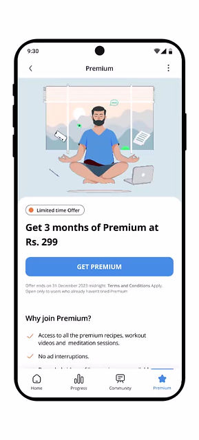
PREMIUM MEMBERSHIP
Depth when you're ready for it.
REFER AND EARN
Community growth built into the product.

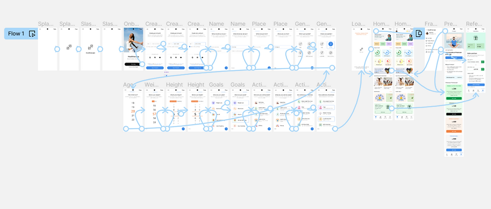
COMPLETE PROTOTYPE FLOW
Every screen connected. Every interaction considered.
Screen Highlights
ONBOARDING
Personalisation before the first tap. Seven questions, not a form.
MEMBERSHIP
Premium depth for when the user is ready.
REFERRAL
Referral rewards aligned with community growth.

WHAT I LEARNED
Designing for consistency taught me to
design against overwhelm.
Healthescape is a self-initiated project. Two to three weeks. No client, no brief, no real users to test with. I want to be honest about that — the absence of real constraints means some decisions were made on instinct rather than evidence.
What the project gave me was the space to pursue one idea all the way to its conclusion. The best health app isn't the one with the most features. It's the one people open every day.
01
Behaviour design is more powerful than feature depth.
The streak counter, the goal tiles, the Day 1 framing — none of these are features in the traditional sense. They're behavioural nudges. Designing for behaviour is a different discipline than designing for function.
02
Simplicity is a design decision, not a design shortcut.
Removing things is harder than adding them. Every screen had to justify its existence. The wireframe phase was brutal — a lot of ideas that seemed valuable didn't survive the "can this be simpler?" test. Restraint is a skill.
03
The onboarding is the first UX promise.
How you ask questions in onboarding sets the user's expectation for every interaction that follows. If onboarding feels like a form, the app will feel like homework. If it feels like a conversation, the app will feel like a companion.
04
Visual warmth is functional.
The pastel tiles, the illustrated icons, the gentle colour palette — these aren't decoration. They're friction reduction. An app that feels calm is easier to open. An app that feels clinical requires motivation to open. The visual language is doing behavioural work.
Healthescape is a self-initiated concept. 2–3 weeks. Built to explore how behaviour design and visual warmth can make consistency feel achievable — not aspirational.
MORE WORK
Keep exploring.
End-to-end case studies documenting research, strategy, and design decisions.


