
PLAXONIC
Information Architecture · Visual System · Enterprise UX
Role: UI UX Designer
Pages: 30+ · Desktop & Mobile
Duration: 6-8 Weeks
Tools: Figma · Adobe Suite
THE HOOK
The website had all the information.
It had none of the clarity.
Plaxonic Technologies had been operating since 2013. By the time I joined, they had offices in Delhi, Bangalore, Dubai, Amsterdam, and Rhode Island. Over 200 people. Clients in 40+ countries. ISO certifications. A Glassdoor rating of 4.5.
None of that was visible on the website.
What was visible:
A rocket-powered car flying down a highway as the homepage hero. A services page where the images had never loaded — broken alt text reading "agile", "devops", "image-bg-upper" sitting on a live page in production. Blue gradients, teal blobs, purple shapes, circular image crops — every page speaking a different visual language, none of it speaking enterprise.
This was a company underselling itself. Not because the product was weak, but because the presentation had never caught up with the business.
My job was to close that gap.
THE BEFORE
Four problems. One root cause.
An Audit from the buyer's eye, not the designer's eye.
When I started the audit, I wasn't looking for design problems. I was looking for credibility problems — the specific places where a potential enterprise client would close the tab.
I found four:
01 - Brand Identity Gap
The homepage hero was a rocket-powered car on a highway. For a global enterprise IT consultancy operating in 6 countries. The visual language had zero connection to the actual business. A CTO evaluating vendors doesn't want a car metaphor. They want evidence of competence.
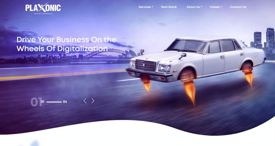_edited_edited.jpg)
02 - No Visual System
Blue-to-purple gradients on Contact. Teal accents on Services. Every page felt like a different designer had built it independently and never talked to anyone else. There was no system — just decoration.

03 - Copy That undermined Enterprise postioning
"Colleagues Cum Companions" — a live section heading on the About page of a company serving enterprise clients in 40+ countries. One heading undid the entire positioning.

04 - No User Journey
The navigation was: Services / Tech Stack / About Us / Career / Contact Us. Flat. No logic. No guided conversation. A potential client had no clear path from "who are you" to "can I trust you" to "let's talk." Every page was a brochure. None of them were a step in a journey.

The root cause underneath all four: the website had been built to look like a technology company, not to function like one.
THE DIAGNOSIS
This wasn't a visual problem. It was a positioning problem.
Before I opened Figma, I spent time understanding what Plaxonic actually was versus how it was presenting itself.
What Plaxonic was
-
Mature global IT consultancy, est. 2013
-
ISO 27001 & ISO 9001 certified
-
Great Place to Work certified
-
200+ people, offices in 4 countries
-
Clients in 40+ countries
-
Products in market — AACE LIMS, CloudOps Manager, Datacart 360
-
Government-grade clients — Delhi Jal Board
What the Website said
-
Rocket car on a highway
-
Green blobs and teal gradients
-
"Colleagues Cum Companions"
-
17 services listed alphabetically
-
No leadership visible anywhere
-
No certifications surfaced
-
No structure for case studies or trust signals
The gap between those two things was the actual design problem.
Most enterprise IT buyers — CTOs, procurement heads, digital transformation leads — don't read a website the way a consumer does. They scan for signals. Is this company credible? Have they done this before? Can I trust them with a multi-year engagement?
The old site answered none of those questions. It was asking visitors to take a leap of faith on a company that looked like it had been around for three years.
Three decisions came out of the diagnosis.
01
Structure first.
The navigation needed to reflect how enterprise buyers think, not how Plaxonic organised internally. Out: Services / Tech Stack / About Us / Career / Contact Us. In: What we do / Who we are / Insights / Careers.
02
Trust signals before conversion.
Before asking anyone to "Get in touch," the site needed to earn it. Leadership. Case studies. Certifications. Community work. All of it surfaced and structured — not buried.
03
One visual language.
Every page needed to feel like the same company made it. Consistent typography, consistent white space, consistent CTA behaviour. Not decorative — structural.
THE THINKING
Structure before design. Always.
The IA came before any visual decisions. I needed to know what the site needed to contain before I could decide how it should look.
The old site had five navigation items. The new architecture had four — but each one expanded into a complete sub-ecosystem. Thirty pages mapped from scratch. Not templates — deliberate decisions about what information should live where, in what order, for which audience.
THE CLEAREST ARGUMENT — SAME SERVICES. DIFFERENT LOGIC.
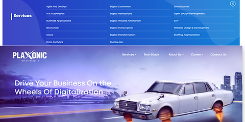
BEFORE — 17 ITEMS. NO GROUPING.

Agile And DevOps · AI & Automation · Business Applications · Blockchain · Cloud · Data Analytics · Digital Commerce · Digital Interactions · Digital Process Automation · Digital Transcription · Digital Transformation · Mobile App · Omnichannel · Open Source Development · SAP · Website Design & Development · Staffing Augmentation
AFTER — 4 CATEGORIES. GROUPED BY BUYING INTENT.
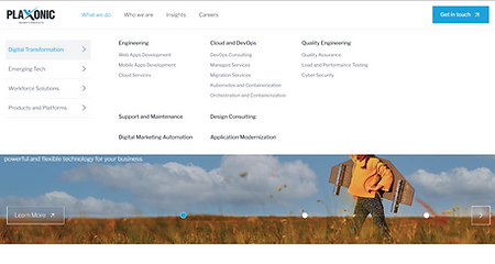
Digital Transformation · Emerging Tech · Workforce Solutions · Products & Platforms
One structural decision changed the entire legibility of the business. A buyer could now orient themselves in under three seconds — understanding what Plaxonic does, finding their own entry point, without reading every item on a list.
INFORMATION ARCHITECTURE

Four primary sections. Thirteen second-level pages. Thirty-plus third-level pages. Mapped before any visual design began.
USER JOURNEY MAP

Six phases from understanding to execution — research, architecture, exploration, visual system, content, and final delivery.
Three structural decisions
Splitting services into four distinct buckets.
The old site had a flat Services dropdown — 17 items, no grouping, no logic. I reorganized around how clients actually evaluate IT vendors: Digital Transformation for what we build, Emerging Tech for what we specialize in, Workforce Solutions for how we staff, Products & Platforms for what we own. Four buckets. Four different buying conversations.
Building a 'Who we are' universe — not just an About page.
Most IT companies have one About page. Plaxonic had a culture worth showing — real people, real CSR work, real certifications, a genuine leadership team. I built six subsections each serving a distinct trust-building function. Leadership. Awards. Community. Culture. Our Story. The Plaxonic Difference. Each one a separate page. Each one a signal.
Creating a Careers funnel with deliberate stages.
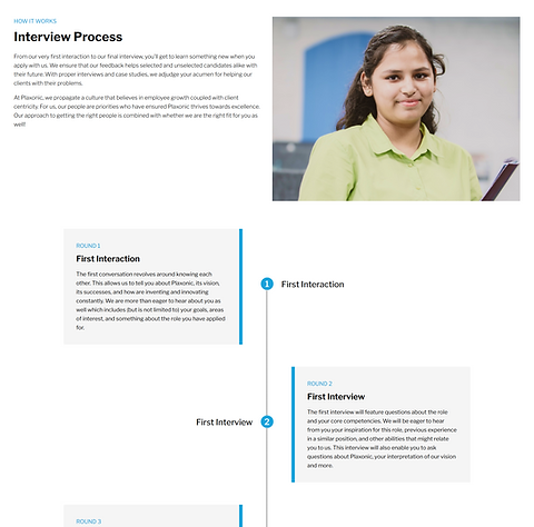
The old Careers page had motivation-poster copy and no journey logic. I rebuilt it as three deliberate stages — why join, what life looks like here, how to apply. Each stage addresses a different moment in a candidate's decision. The interview process got its own page, visualized as a five-step journey.
The design execution followed directly from the structure. Once the architecture was clear, every visual decision became straightforward.

THE SOLUTION
Before. After.
Same company. Different story.
The redesign didn't invent a new Plaxonic. It made the existing one visible.
HOMEPAGE
The front door. The first thing every potential client, candidate, and partner sees. This is where the brand-reality gap was most visible — and most damaging.
BEFORE
.png)
AFTER

From rocket car to capability messaging. From flat nav to four-category structure.
NAVIGATION
One structural decision that changed the entire legibility of the business. Same services. Completely different logic.
BEFORE
AFTER

Before: 17 services. No grouping. After: 4 categories. Grouped by buying intent.
ABOUT
One page became six. Each subsection serving a distinct trust-building function — not decoration, not filler. Evidence.
BEFORE

AFTER

From one cluttered page to six focused subsections. Leadership made visible for the first time.
CAREERS
The old Careers page was a brochure. The new one is a funnel — three deliberate stages for three different moments in a candidate's decision.
BEFORE

AFTER
From motivation-poster copy to a structured three-stage candidate journey.
What remained the same across everything: the underlying content. The real Plaxonic was always there. It just needed a structure that let it be seen.
WHAT I LEARNED
Most website problems are not design problems.
They are clarity problems.
01
Audit with a buyer's eye, not a designer's eye.
I wasn't asking "does this look good?" I was asking "would a CTO trust this?" Those are different questions. They lead to different diagnoses.
02
IA is UX.
Most of the experience of navigating a website is navigating its information architecture. If the structure is broken, no amount of visual polish fixes it.
03
Real constraints are part of the work.
The hero carousel was a stakeholder decision I disagreed with. The copy was handled by a separate writer. Some photos changed after I left. This is what client work actually looks like — partial control, a lot of negotiation. The job is to protect the decisions that matter most.
04
Every page is a trust signal.
A broken image isn't a technical problem. It's a statement: we don't check our own work. "Colleagues Cum Companions" isn't a copy problem. It's a positioning problem. Enterprise clients read every element as evidence about how a company operates. Design work is making sure that evidence tells the right story.
This is one project from my time at Plaxonic Technologies, 2022–2024. End-to-end UX across 8+ client projects — in addition to this complete website redesign.
MORE WORK
Keep exploring.
End-to-end case studies documenting research, strategy, and design decisions.


