
KALLISTI
E-Commerce UX · Brand Systems · Self-Initiated · 2026
Role: UI UX Designer
Screens: 48+ | Mobile & Web
Duration: 4 Weeks
Tools: Figma · Illustrator · ChatGPT
THE CONCEPT
What happens when you take a 3,000-year-old story and ask it to sell desserts to someone sitting on their couch in Berlin?
Kallisti is a self-initiated project — no client, no brief, no guardrails. Just a concept that deserved to be taken seriously.
Four weeks. 48 screens. One myth, made shoppable.
BRAND IDENTITY
Before the first screen, there was a world to build. Kallisti needed to feel ancient without feeling heavy.
COLOR SYSTEM:


Deep navy — trust, premium, Aegean nights
Gold — heritage, craft, the gods' currency
Cream — warmth, approachability, the softening agent
TYPOGRAPHY:

Classical serif for heritage. Monospace for function. The tension between them is intentional.
ICONOGRAPHY & ILLUSTRATIONS:


Every icon references Greek visual culture — laurels, amphorae, olive branches — redrawn for digital clarity.
BRAND SYSTEM OVERVIEW:

THE CHALLENGE
Mythology is heavy. Trust is fragile. Checkout is brutal.
Three problems had to be solved simultaneously — and they pulled in different directions.
01
Making heritage feel appetising, not intimidating
Greek mythology carries weight. The risk was designing something so ornate it felt like a history lesson. Every visual decision had to ask: does this make someone want to eat something?
02
Building trust across borders
Kallisti ships internationally — which means a user in Berlin is handing over their credit card to a brand they've never heard of, for food they can't taste before buying. Trust signals had to live at every touchpoint.
03
Keeping mythology alive through a 4-step checkout
The hardest UX challenge wasn't the hero page. It was staying on brand while asking someone for their shipping address and card number. Most brands abandon their personality at the transactional layer. Kallisti couldn't.
PROCESS
Structure first. Story second. Screens last.
Before any visual decisions, I mapped the complete information architecture — every page, every flow, every state. The goal wasn't thoroughness. It was finding where mythology could live functionally, not just decoratively.
The insight that shaped everything: every touchpoint in an e-commerce flow has an emotional register. Discovery is curiosity. Product pages are desire. Checkout is anxiety. Post-purchase is relief. The mythology needed to match each emotional register — not just sit on top of it.
INFORMATION ARCHITECTURE:

USER FLOW:

WIREFRAMES:


Quick iterations to test layout logic before visual decisions.
DESIGN
Three systems. One world.
The final design is built around three interconnected systems — each solving a different layer of the problem.
SYSTEM 01
Every God has a job.
The authentication screens presented a specific challenge — how do you stay on brand during the most functional, least emotional moments of the user journey?
The answer was assigning mythological characters to specific functional roles:
-
Athena guards login and security. Her shield carries the lock.
-
Hermes handles all communication flows. He delivers the reset link — because that's literally what the messenger god does.
-
Nike appears at moments of success — account created, password reset, order confirmed.
These aren't illustration choices. They're UX decisions expressed through visual language.

Athena guards the gate

Hermes takes the message

The lock opens

The door opens

The key changes hands

You are in
SYSTEM 02
Loyalty tiers that actually feel like mythology.

Most loyalty programs feel like spreadsheets. Kallisti's rewards system uses the Greek heroic journey as its structure:
Initiate → Hero → Demigod → Olympian
Each tier has a name that means something. Earning points isn't just accumulating numbers — it's ascending through the ranks of Greek legend. The copy at each tier isn't decoration. It's retention strategy.
SYSTEM 03
The brand voice never clocked out.
Every touchpoint is a brand moment — including the ones most designers leave generic.

Sweet things await

Let's fill it with sweetness

One step away from dessert bliss

This pastry crumbled

Handmade, just for you

We treat filo like paper-thin glass
COMPLETE EXPERIENCE
Every screen. Every touchpoint. Every myth.
Every touchpoint is a brand moment — including the ones most designers leave generic.
Landing & Discovery (4 screens): brand entry point and shopping experience
Landing page · Shop page · Product detail page · About page

The Transaction (4 screens): the complete purchase journey
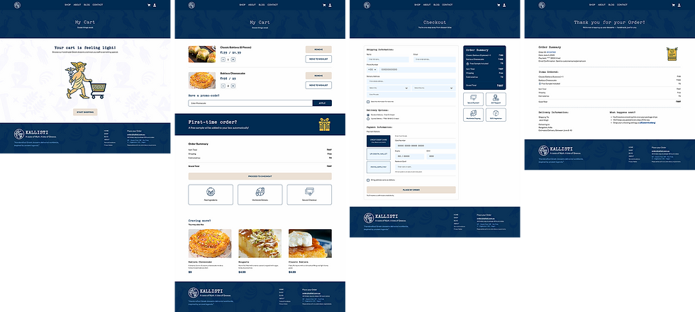
Cart · Checkout · Order Confirmation
Account & Loyalty (3 screens): retention and personalization thinking
My Orders · Wishlist · Rewards page

Authentication (7 screens): the mythological character system in action
Login · Sign Up · Forgot Password

Edge Cases (5 screens): brand consistency at every touchpoint
404 page · Empty wishlist state · Blog · Blog description page

REFLECTION
What Kallisti taught me.
The most interesting design problems in this project weren't the ones I expected.
I spent the first week worrying about the hero page. It came together relatively quickly. The harder problems were the ones I hadn't anticipated — how do you write a 404 error message that sounds like Kallisti? How do you design a password reset flow that doesn't break the spell?
Those problems taught me something I now apply to every project: brand coherence is a systems problem, not a visual problem. You can have beautiful screens and a broken brand if the voice disappears the moment someone clicks "forgot password."
WHAT I'D DO DIFFERENTLY
Test the microcopy with real users from different cultural backgrounds. "This pastry crumbled" lands beautifully in English. I have no idea if it translates into German, Greek, or Hindi. For a brand positioning itself as globally shipped, that's a real gap.
WHAT'S NEXT
The rewards system is the most underdeveloped part of the project. The tier names are strong. The points mechanics are logical. But the actual experience of leveling up — the moment you go from Hero to Demigod — deserves its own screen, its own illustration, its own celebration. That's the next design problem worth solving.
MORE WORK
Keep exploring.
End-to-end case studies documenting research, strategy, and design decisions.


