top of page

01 — THE HOOK
Three days. 22 components. 600+ variants.
Built twice — once for when it works,
once for when it doesn't.
Most of what makes a design system look finished is the version that performs well in a walkthrough: the dropdown opens cleanly, the KPI card shows a confident upward line, the table is full of rows that all loaded on time. Vela has that version — a complete B2B revenue intelligence system, tokens through templates, light and dark, built end to end on Figma's free plan.It also has the version most systems skip: what the dropdown looks like when the data behind it has gone stale, what the KPI card says when the feed disconnects, what the table shows when a search dead-ends. The first is the baseline — most systems get that far. The second is what's actually being tested here.

The version most systems skip — designed with the same rigor as the happy path.
02 — THE BUILD
The constraint came first.
Figma's free Starter plan caps Variable collections at a single mode — real Light/Dark theming needs a Professional plan. Confirmed by testing directly: tried adding a second mode, watched it lock immediately. Vela's three-layer token system — primitive, alias, component — was built on ordinary Styles instead: identical alias names holding different values depending on which mode's Style page they're pulled from.


bg/surface, text/primary, brand/primary — same names, different values, same logic underneath.
The same instinct — solve it properly, not quickly — showed up everywhere else in the build.
The Dropdown
Not one component with an open-and-closed state. Three: a Trigger, a Menu, and an Open variant that composes them together — the same pattern mature systems like Figma's own run on. The cost of the architecture showed up later, but it meant every fix updated downstream instead of needing a patch.


Three components pretending to be one control.
The Modal
The first pass looked, by its own designer's word, like last decade. The rebuild borrowed from how Linear and Stripe handle the same problem. What stuck is the header tint — the colour registers before the title text does.


Red for destructive. Amber for urgent. Blue for a neutral.
The Icon Button
First build had 192 variants on the assumption that instance-swap properties cascade to all variants. They don't. Rather than fixing 192 individually, the architecture changed: Icon Button defines size, padding, colour, and state. The icon is a separate instance placed on top, swapped independently.


Out: 192 individual fixes. In: one contract change.
The Data Table
Most tables build states at the row level. Vela's are built at the cell level across all six cell types. One rule applied without exception: number cells are right-aligned — the same convention spreadsheets and financial tools have used for decades.

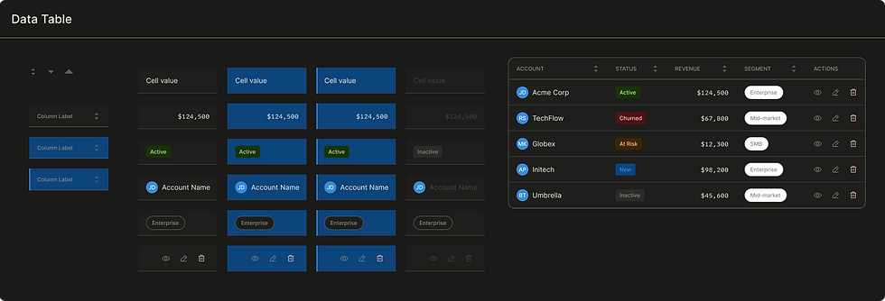
Built at the cell, not the row. The table is just where the cells happen to be standing.

The same standard, applied 22 times — light and dark both.
03 — THE THESIS
The part most systems leave for later.
Calibrated Urgency.
Most design systems stop at error states — a red border, a generic "something went wrong," done. It's not enough once the product is something people check every day, where a number that hasn't updated in an hour and a feed disconnected for six hours aren't the same emergency and shouldn't look like one. Vela handles that with three tiers — Informational, Warning, Critical — built so each step up is a gear shift, not a louder version of the last alarm.


Tier 1 notes. Tier 2 warns and offers a way out. Tier 3 states the fact and offers nothing — because there's nothing to click.
Three surfaces. One framework.
Failure in a product like this doesn't have one shape. It shows up at three different levels.
The input level
A required field left empty, an email that doesn't parse — caught inline the instant it's wrong.


Caught at the source, the moment it's wrong.
The content level
A search that dead-ends. No deals added yet. No permission to view a section. Each handled as its own empty state with its own explanation — not a blank rectangle standing in for an apology.


Every empty state has a reason. None of them are blank rectangles.
The system level
The feed itself — delayed or disconnected. Every KPI card built on top of it now carrying a number that stopped being current the moment the connection did.


Same card. Three different things it might be telling you.
Toast vs Banner
The line between them isn't severity — it's whether the problem is in the way of what's happening right now.
_.png)
.png)
Toast is for problems outside what you're doing. Banner is for problems inside it.
04 — THE SYSTEM IN USE
Same system, three places to look.
Tokens
Every Light and Dark value in Vela answers to the same alias name — swap the mode, the meaning doesn't move.


Color, typography, spacing — every decision in the system traces back to here.
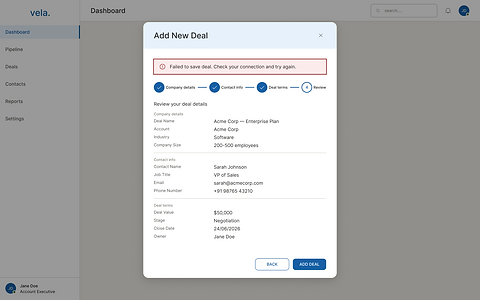
Escalation, in context
The montage showed the components. These are the same decisions caught inside an actual product flow.

.png)
Same modal, same form, one save that didn't go through. The banner sits inside the flow it broke.


A table is only ever one filter away from looking like this.
_.png)
%20-%20Dark.png)
The version every demo shows. It exists here too — it's just not the only thing that exists.
None of this is on screen to be admired. It's on screen because someone is going to glance at a number on a Tuesday afternoon and decide, in about two seconds, whether to trust it.
05 — WHAT THIS PROVES
What's actually on the line in Vela is small: a missed follow-up, a forecast a sales lead trusts before a renewal call, a number that reads wrong for an hour before anyone catches it. None of that is dramatic. But the system was built as if it had to hold up under the same question every interface eventually faces.
A complete system is the baseline. Designing for what breaks is the part most people skip.
The instinct itself doesn't care what's at stake. Whether the cost of being wrong is a missed follow-up or something heavier, the design question stays the same: what does an interface owe the person looking at it the moment it stops telling the truth.
Scope, stated plainly
Vela has 22 components and 600+ variants, light and dark, end to end from empty state to closed deal — and it doesn't have motion tokens, a mobile component set, a charting library beyond a single sparkline, developer handoff or code export, or a formal accessibility audit. None of that is hidden in the file; it's just not built yet. Getting from here to a production-ready system — roughly 47 more components, full token coverage for motion and elevation and focus states, real documentation, a real audit — is closer to 140 to 185 hours of work. Three to four weeks full-time. Six to eight at side-project pace.
Explore on Figma community

Vela is published on Figma Community — open to view, duplicate, and use. The full file includes every component with light and dark variants, the complete token architecture, and the 19-screen product flow from empty state to closed deal. Everything documented in this case study is in there, at full fidelity.
MORE WORK
Keep exploring.
End-to-end case studies documenting research, strategy, and design decisions.


bottom of page